

Introduction
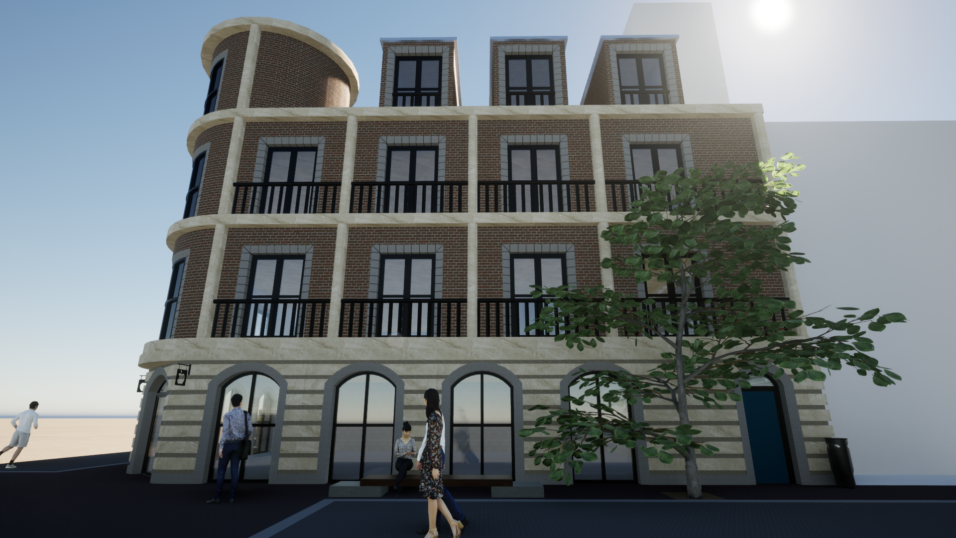
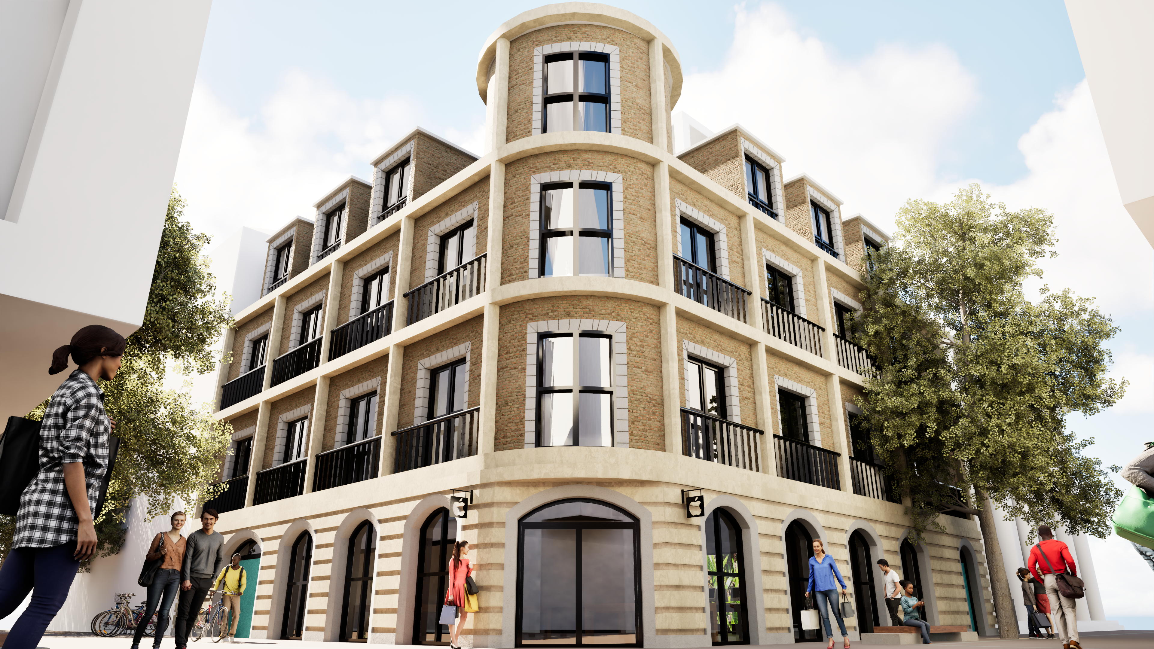
Apple Store Nijmegen is architecture shaped by reference and use — a new building on the site of a former shop once occupied by H&M. The design references the rich Roman history of Nijmegen through a classical formal language: columns, symmetry, and a base with a monumental presence. Amid the many modern shopfronts in this part of the shopping district, the building doesn't stand out because it differs, but because it reaches back to something old while remaining unmistakably of this time.
That reference only works through the use the building carries. A classical façade without a living program behind it is decor; here, the formal language gains meaning through a retail base that opens toward the street and connects the neighbourhood, its residents and the urban surroundings, and through a three-storey apartment above the store, with a unique back garden set in the middle of the shopping district. Use is not incidental here, but the condition that legitimizes the reference: not as a copy of the past, but as a contemporary building that refers to it.
History
Molenstraat is one of the oldest streets in Nijmegen's city centre. For centuries, the end of the street was marked by the Molenpoort (also known as the Windmolenpoort), a medieval city gate from the 14th century that marked the entrance to the city. The gate remained standing until 1879; its demolition removed the last physical boundary between Molenstraat and the rest of the inner city.
After the gate's demolition, the street gradually changed character. Where Molenstraat had previously consisted largely of residential properties, these were replaced step by step in the following decades by commercial buildings, making it one of the city's most important shopping axes. The bombing of 22 February 1944, which devastated large parts of Nijmegen's inner city, largely spared Molenstraat; only the north side, in particular the Molenstraatkerk, suffered serious damage. Unlike many surrounding streets, Molenstraat was therefore able to continue developing as a shopping area without large-scale reconstruction.
The building at Molenstraat 5-7 is a product of this development: built in 1954, without listed status, as one of the many commercial buildings that gave the street its current character over the course of the 20th century. Until recently it housed a branch of H&M. This design replaces the existing building with a completely new structure, which takes on its new function as an Apple Store on the same site.
Molenstraat within the historic urban fabric of Nijmegen — the project site in context
Street view from Molenstraat — the store façade in dialogue with the historic city fabric
Vision
Where Apple globally typically employs the same design vocabulary — glazed, minimalist pavilions that barely differ from city to city — this design makes the opposite choice: a façade that explicitly ties itself to Nijmegen. Just like the Dutch Apple Stores in Amsterdam and The Hague, housed in monumental buildings such as the Hirsch building and De Passage, this design combines a classical formal language with contemporary Apple elements — with the difference that here no existing monument is being repurposed, but a completely new building is being erected. Columns, symmetry, and a monumental base replace the glass showcase; the retail space on the ground floor nevertheless opens fully to the street, while the apartment above is set back.
That choice also works at street level: the façade composition connects with the rhythm of the surrounding historic buildings on Molenstraat, with varying window proportions and a restrained material palette. Where many Apple Stores distinguish themselves by radically departing from their surroundings, this design chooses to integrate.
That reversed principle is not without risk. Amsterdam and The Hague derive their credibility from a genuine history; a new building that adopts the same classical language without that history risks appearing as pastiche. The design addresses that tension by rebuilding the classical formal language with contemporary means and allowing it to coincide with a function specifically tailored to this place: an apartment with its own back garden, a base that opens to Molenstraat. In this way, the building only becomes credible when it functions just as well here as it looks here.
Design
The vision translates into a design of two interconnected volumes: an open base at street level and an apartment above. The ground floor retail space is conceived as a single column-free space, flooded with daylight through the street-level windows. These windows do more than admit light: they create a direct visual connection with the shopping street, so that passers-by on Molenstraat can look into the interior and are prompted to enter the store. Product display is kept minimal, so the architecture itself sets the tone — a laminate floor in warm wood tones creates a material warmth that softens the brand's typically cool aesthetic.
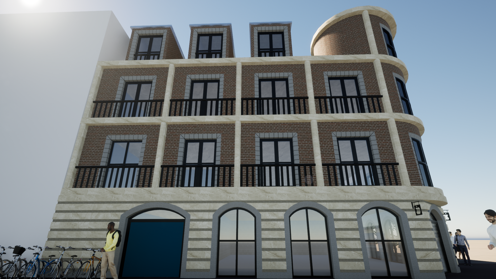
The two volumes relate differently to street and city. The base is fully open and public toward Molenstraat: visible, accessible, aimed at attracting shoppers. The apartment above turns away from the shopping street — it is accessible via its own private entrance from the side street, separate from the shopping route, and offers panoramic views from above over the rooftops of Nijmegen's historic centre. The separation between store and dwelling is therefore complete: no shared entrance, no shared route, only the building volume itself is shared.
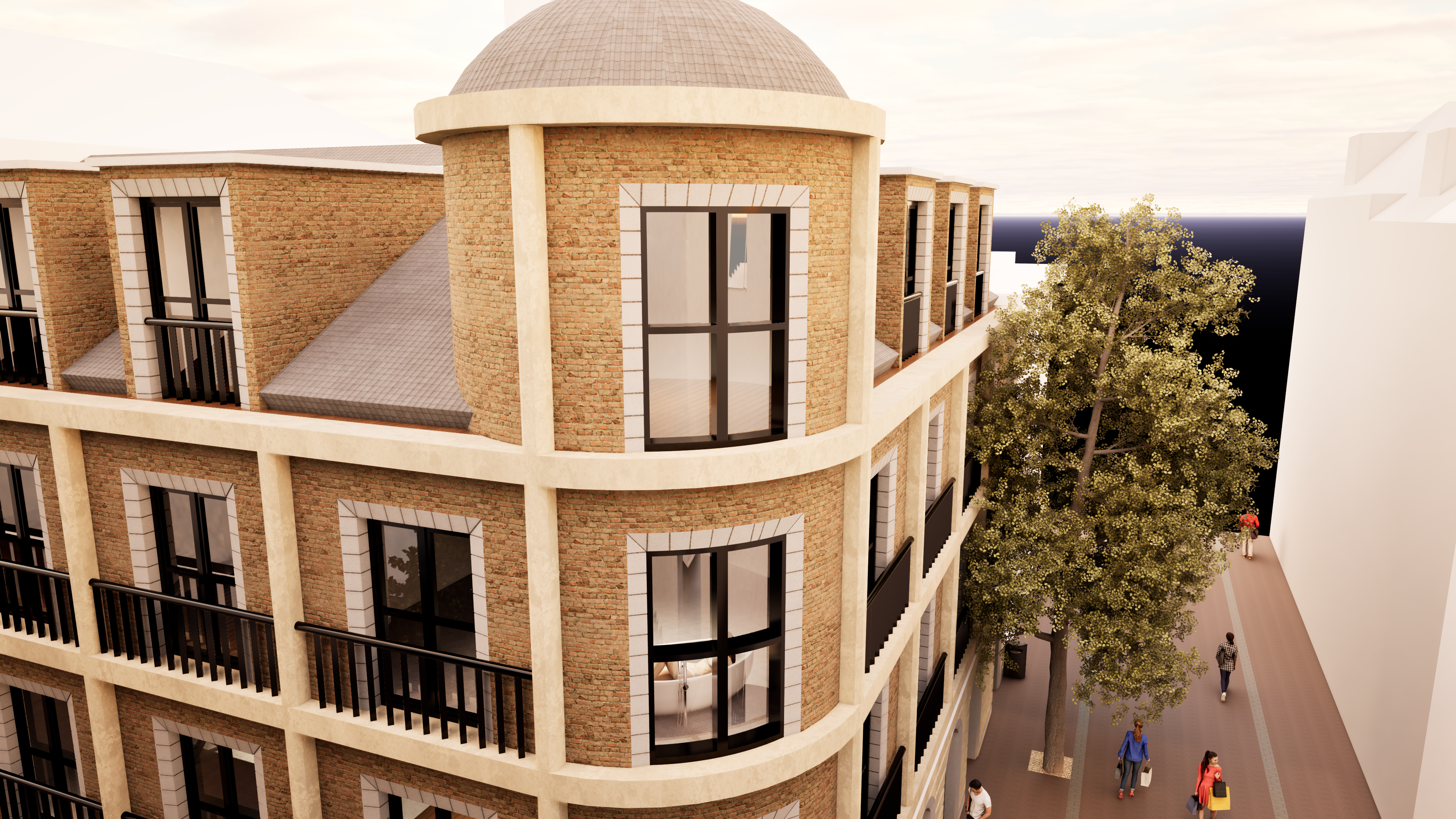
Material and detailing underline this difference, without detaching the two volumes from each other. The base is clad in natural stone (slate), suited to the monumental, classical appearance the store must project toward the street. The apartment above is executed in brick — a different material, with its own texture and scale, but deliberately kept in the same colour register as the slate of the base below. The distinction between store and dwelling thus remains readable in the material, while the colour continuity still allows the two volumes to read as one coherent building.
 Existing
Design
Existing
Design
Ground floor plan — the retail space and its relationship to the street and passage
Functions
Where Design describes the form and material of the two volumes, this section concerns what takes place within: who uses the building, how store and dwelling relate to each other, and which functions are placed where.
Users
The principal users of the building are customers of the ground floor store and the resident(s) of the apartment above. Both groups move entirely separately through the building: shoppers enter via Molenstraat, the resident via their own entrance from the side alley. Beyond the shared building volume, there is no physical point of contact between the two user groups.
Store
The retail space is organised as an open, light-filled hall. Product display tables float in the space without interrupting the floor — visitors move freely, guided by light and material rather than walls or barriers. Daylight and sightlines enter through the street-level windows in the classical façade; these windows simultaneously create a direct visual connection with Molenstraat, so that passers-by can look into the interior and are prompted to enter the store. The floor is finished in laminate with warm wood tones, which softens the brand's typically cool aesthetic.
Apartment
The apartment is located on the upper floors above the store, entirely independent and accessible via its own entrance from the side alley. The layout follows the historic plot width of the building, with generous ceiling heights and windows overlooking the medieval rooftops of the city centre. It is a quiet dwelling in the heart of Nijmegen's busiest shopping street.
Commercial
The location in the pedestrian zone makes the building commercially highly attractive. The corner position at the side alley creates sightlines from two directions and allows a second entrance, enabling visitor flow to pass through the store. The apartment above reinforces the commercial viability of the project: income from the dwelling subsidises the commercial use, keeping the retail space available at market-competitive rents.
Existing
Design
Ground floor plan — the retail space and its relationship to the street and passage
Construction
The structural design follows directly from the two volumes already described under Design. The building is executed entirely in concrete throughout its full height. On the ground floor, the concrete structure is reduced to a minimal number of columns — necessary to achieve the open, transparent base without interrupting the retail space. Above the shop floor, the structure densifies into full concrete walls, suited to the scale and weight of the upper floors.
This transition from open to closed concrete is not only structural, but also visible: the same boundary that separates store from dwelling is also the boundary where the structure changes character. The building is constructed entirely new; no use is made of the existing foundations or masonry of the building that previously stood here.
This structural choice makes tangible what the motto of this project intends: reference and use are not two separate themes here. The open concrete structure on the ground floor makes possible the transparent, public base that the retail function requires; the densified structure above provides the mass and privacy that dwelling requires. Without that structural distinction, the classical formal language of the façade — columns, symmetry, a monumental base — could not coincide with the function the building actually carries.
Conclusion
Apple Store Nijmegen succeeds in making its motto concrete. The reference does not remain a decorative gesture: columns, symmetry, and a monumental base determine the main form of the building, while that same base opens fully to Molenstraat through large windows — precisely the transparency the retail function needs. Above that base, the apartment retreats into brick, in the same colour register as the slate below: reference and use are here visibly interwoven, not placed side by side.
At the same time, the choice for classical new construction brings a tension that does not fully disappear. Unlike the Dutch Apple Stores in Amsterdam and The Hague, which derive their classical appearance from an authentic, restored monument, this building is entirely new: the foundations, the walls, the façade — none of it existed here before. That inevitably brings the risk of pastiche: a classical language without its own history to fall back on. The design does not conceal that risk, but addresses it by allowing the classical formal language to coincide with a function specifically tailored to this place — not decor, but a building that must function just as well as it must look.
What remains is a design that does not copy the history of the place but reinterprets it, without concealing that it is a new addition. It is precisely in that honesty — a building that looks old but is explicitly new, and that only stands because it fulfils its function — that the core of what Apple Store Nijmegen wants to be lies.